A collection of my story, past work, and design engineering projects.
About me
has always been driven by curiosity about how design happens. I like understanding what leads to an interface: the product questions, constraints, decisions, and small interaction details that shape the final outcome.
Career
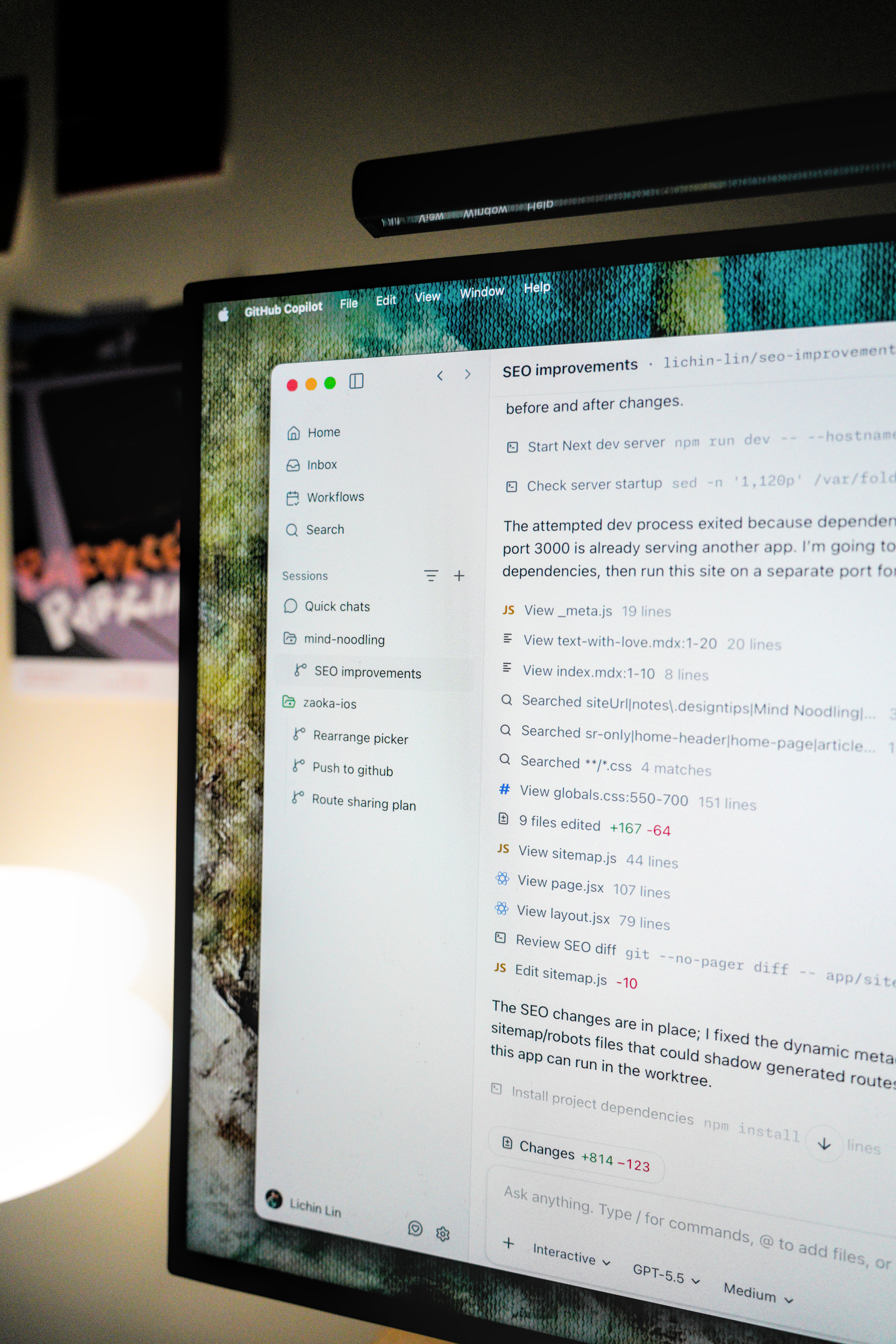
At (2020-23), I worked on internal Figma plugin for design operations. At (2023-24), my focus shifted to website engineering with the marketing and brand team. Now at (2025-present), I work in design engineering across the main product, CLI, and the new GitHub Desktop app.
Projects & community
Outside of work, I've always liked building interface experiments: tools for recording my , explorations, for product builders, and random on the web. They all come from the same place: using code to test interaction ideas and understand how an interface should feel.
Back in Taiwan, I helped run events and shared what I was learning with other designers and builders. Over time, that led to opportunities to attend conferences in the U.S. and share some passion projects on stage.
I think that is a big part of how I learned to think as a design engineer. Side projects gave me a place to explore quickly, polish interaction details, and understand what makes a tool useful or delightful. That mindset also carries into my work at GitHub, which I’ll walk through next.
Design engineering at GitHub
I joined GitHub ~1.5yr ago, and a big part of my work has been thinking about how to make developer interfaces feel smoother and easier to understand.
Main app
One thing I do a lot at GitHub is learn the product through audits. Instead of only looking at one screen, I’ll collect examples across different surfaces — repos, issues, pull requests, diffs, and put them together on a canvas for discussion.
For example, we once looked at truncation issues across the product. At first, it sounds like a small problem: if the text is too long, just truncate it. But in developer tools, not all text is scanned the same way. A file path, branch name, repo name, or issue title each carries different context and importance.
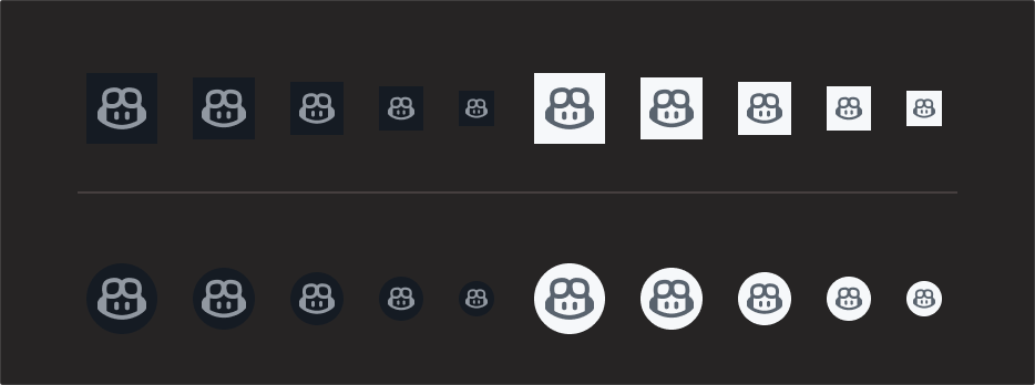
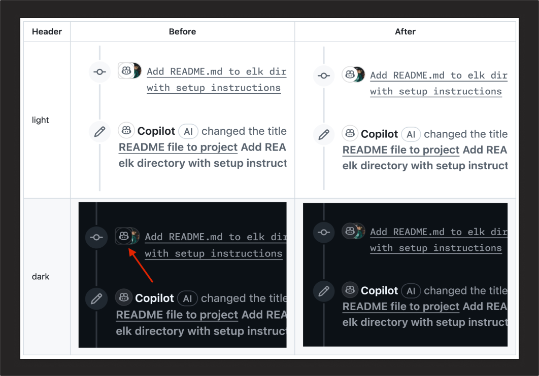
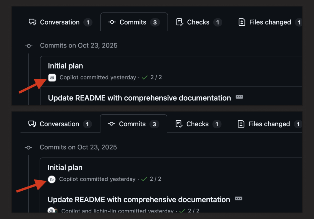
Another small example is the Copilot head shape. We had a discussion around whether it should appear in a circle or a square. That sounds tiny, but inside GitHub, those shapes already carry meaning. A square can feel closer to an orgs or a bot, while a circle is more often associated with a human avatar.
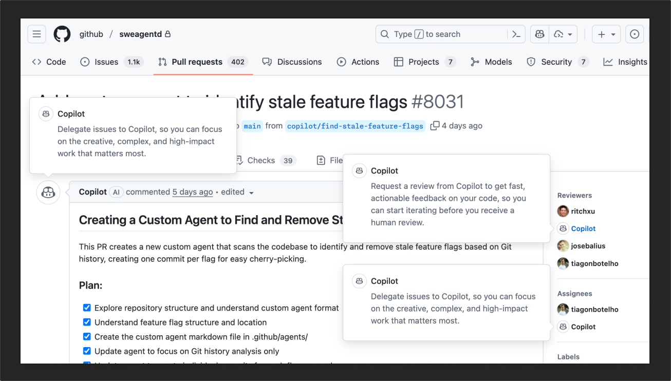
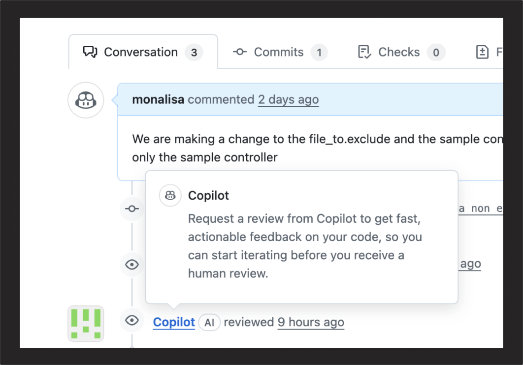
That matters because agents are increasingly treated as teammates that can help move work forward. When Copilot appears near comments, reviews, or activity surfaces, a round shape helps it feel more like a participant in the workflow instead of just a system object.
And of course, after the design audit, we put on PRs:
GitHub Copilot app
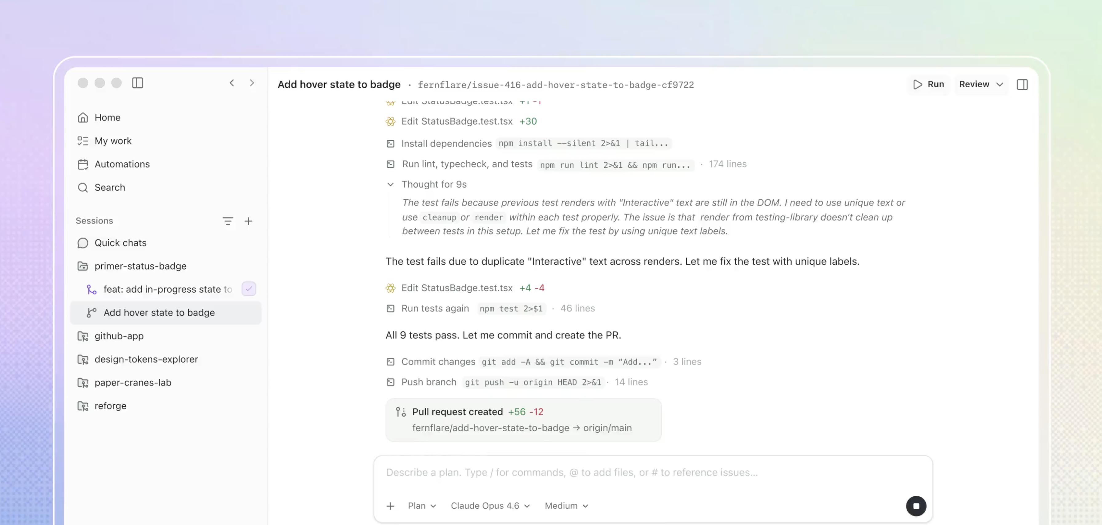
After working across the main GitHub product, we started spending more time on newer Copilot surfaces. Earlier this year, GitHub was exploring how AI changes not only coding itself, but also how people interact with development tools.
One early example was GitHub Copilot CLI, which helped us understand AI interaction in a fast, keyboard-driven environment. But the terminal is not the only surface. A GUI can support richer review, multitasking, and visual context, while also making the experience more approachable for people who are newer to software world.
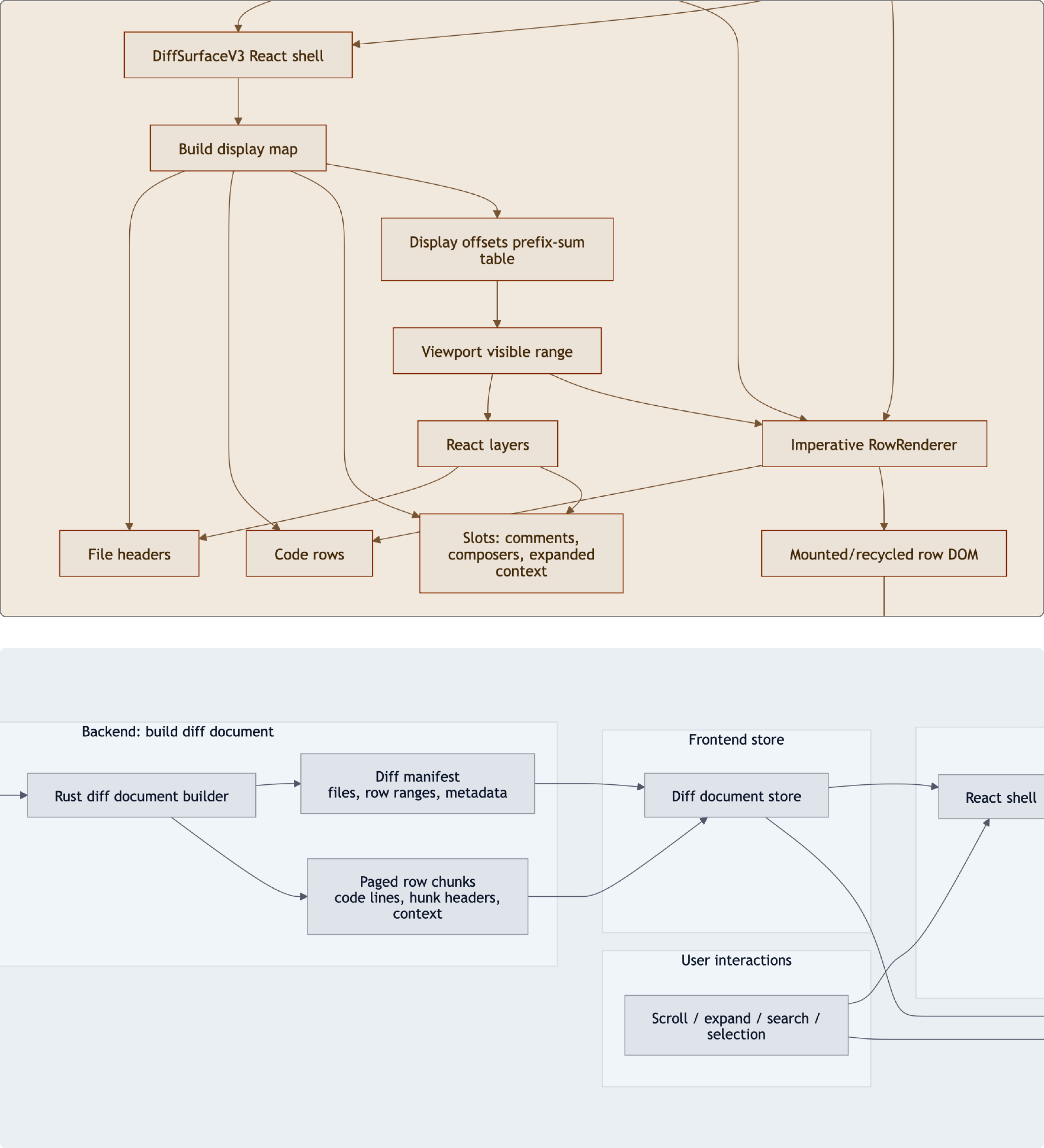
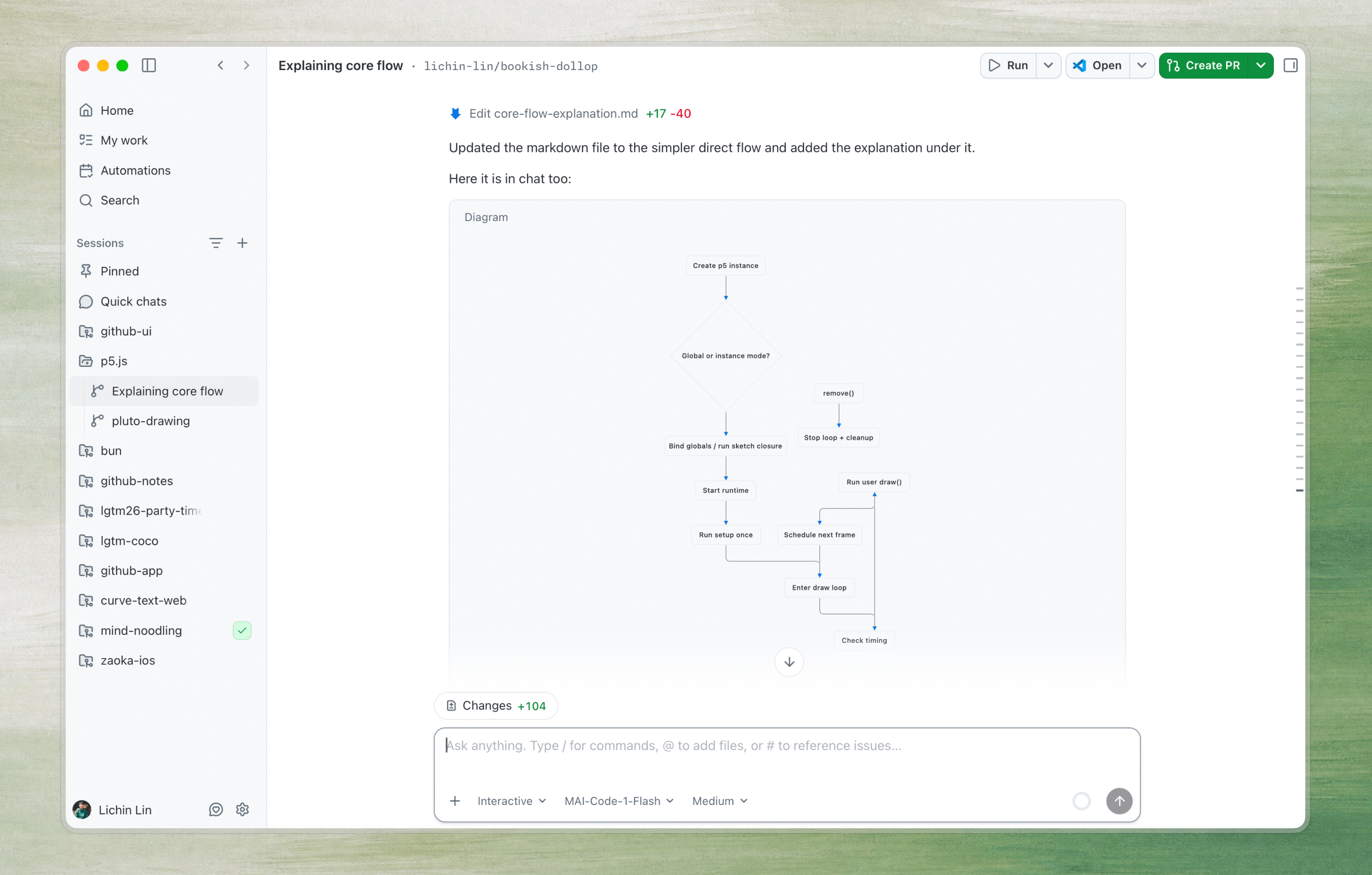
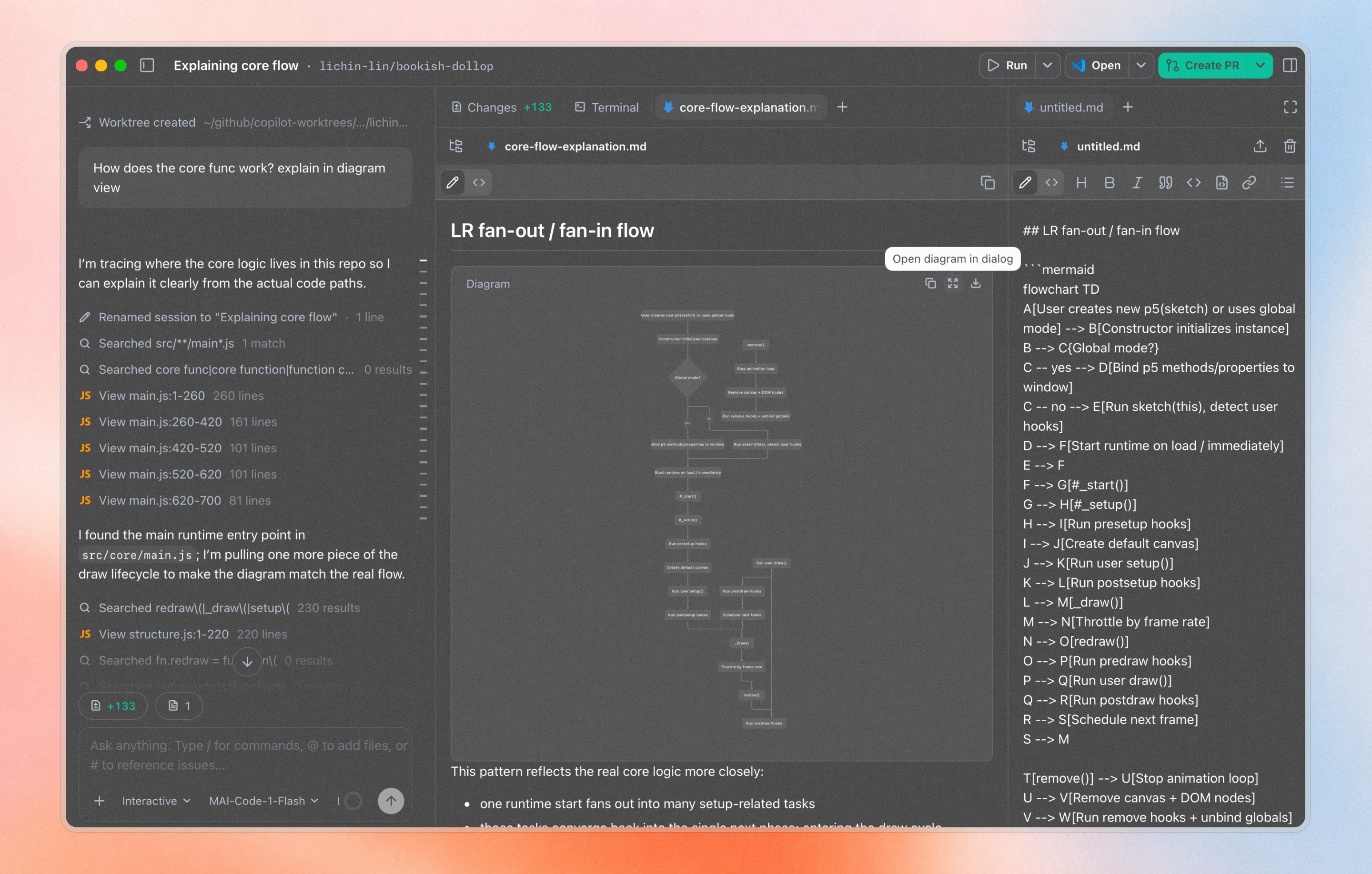
That is where the GitHub Copilot app comes in. It gives us a dedicated surface for AI-assisted development, where chat, code changes, previews, diagrams, diffs, and project context can come together in one place. I worked across a few parts of the app, and I’d focus on the Mermaid diagram experience below.
Connecting the dots
Mermaid is already a popular way for developers to create diagrams from text, and GitHub has supported it for a long time. But the rendering experience can still feel quite basic, especially when diagrams become larger or more complex. We believed that if diagrams could become clearer, more readable, they could become a much better surface for understanding plans and technical context.
I had worked on diagram systems in different contexts before, but many of those ideas had not fully shipped. With the Copilot app, the timing started to make more sense.
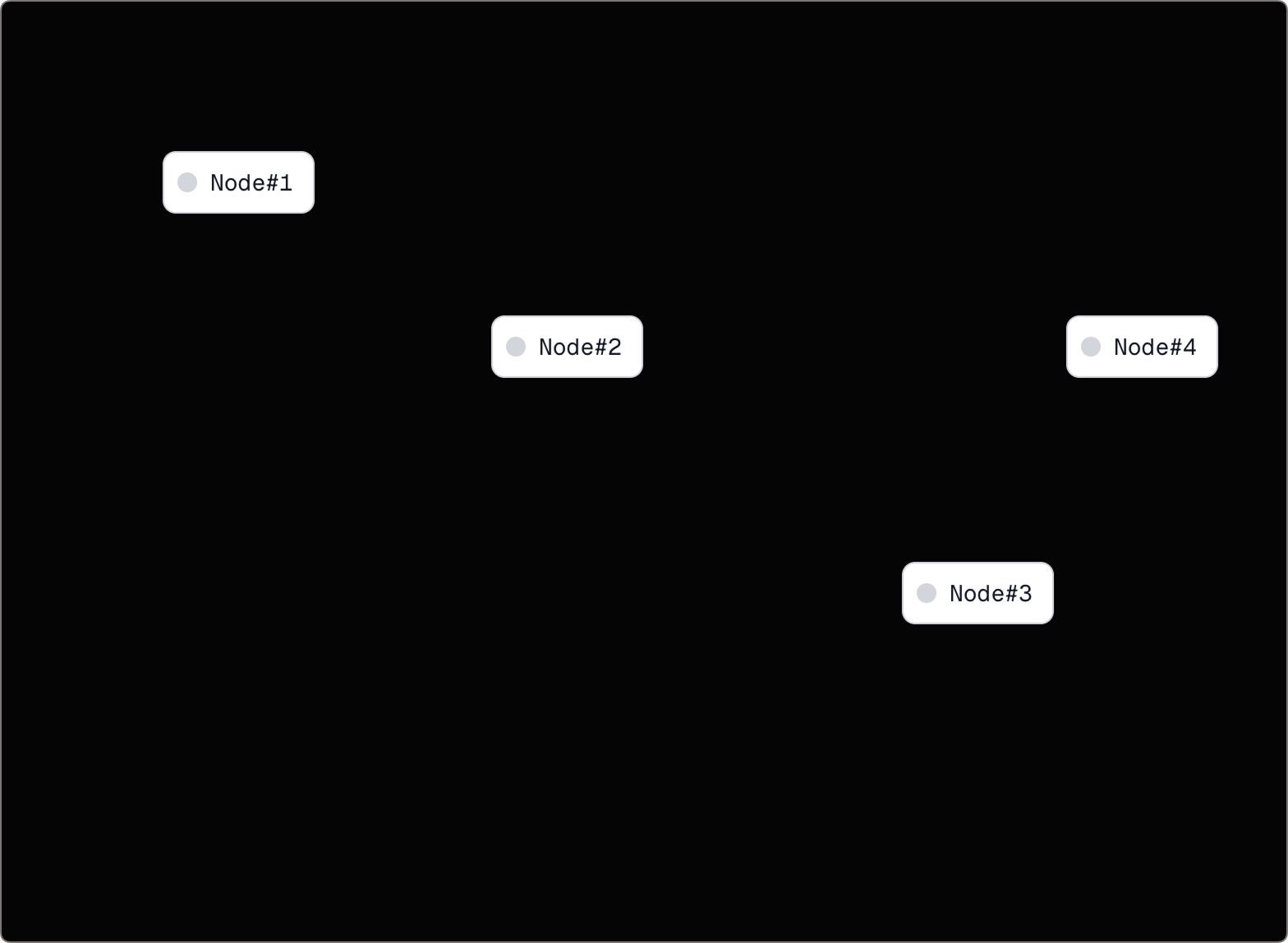
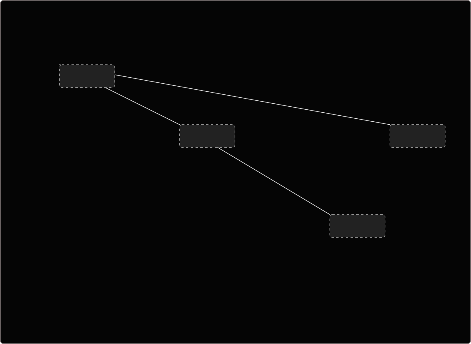
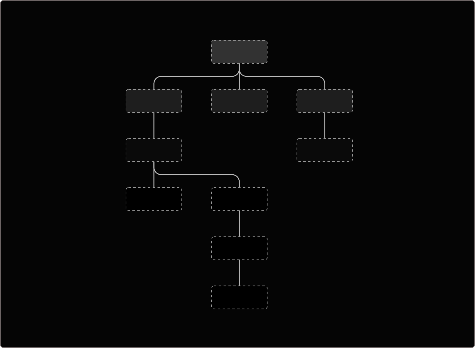
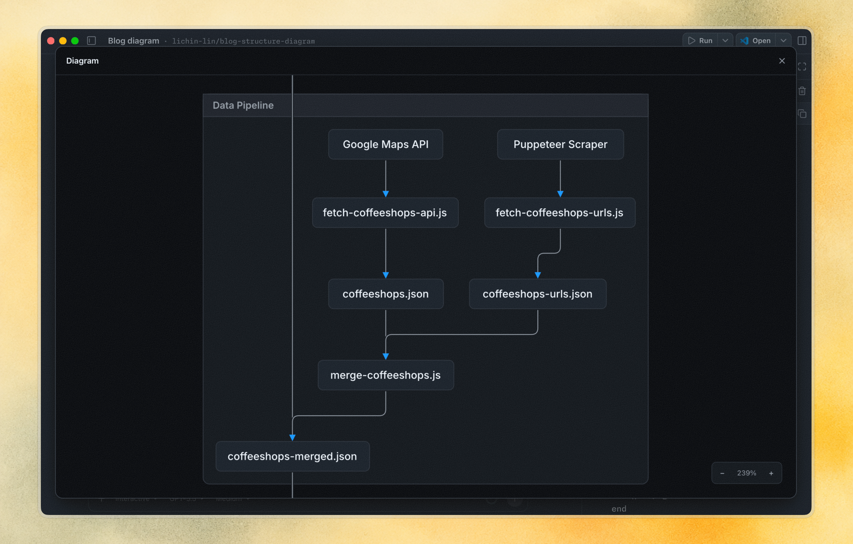
At the most basic level, diagrams are just ideas and information represented as nodes and edges. But without hierarchy, direction, and spacing, the relationships become messy very quickly,
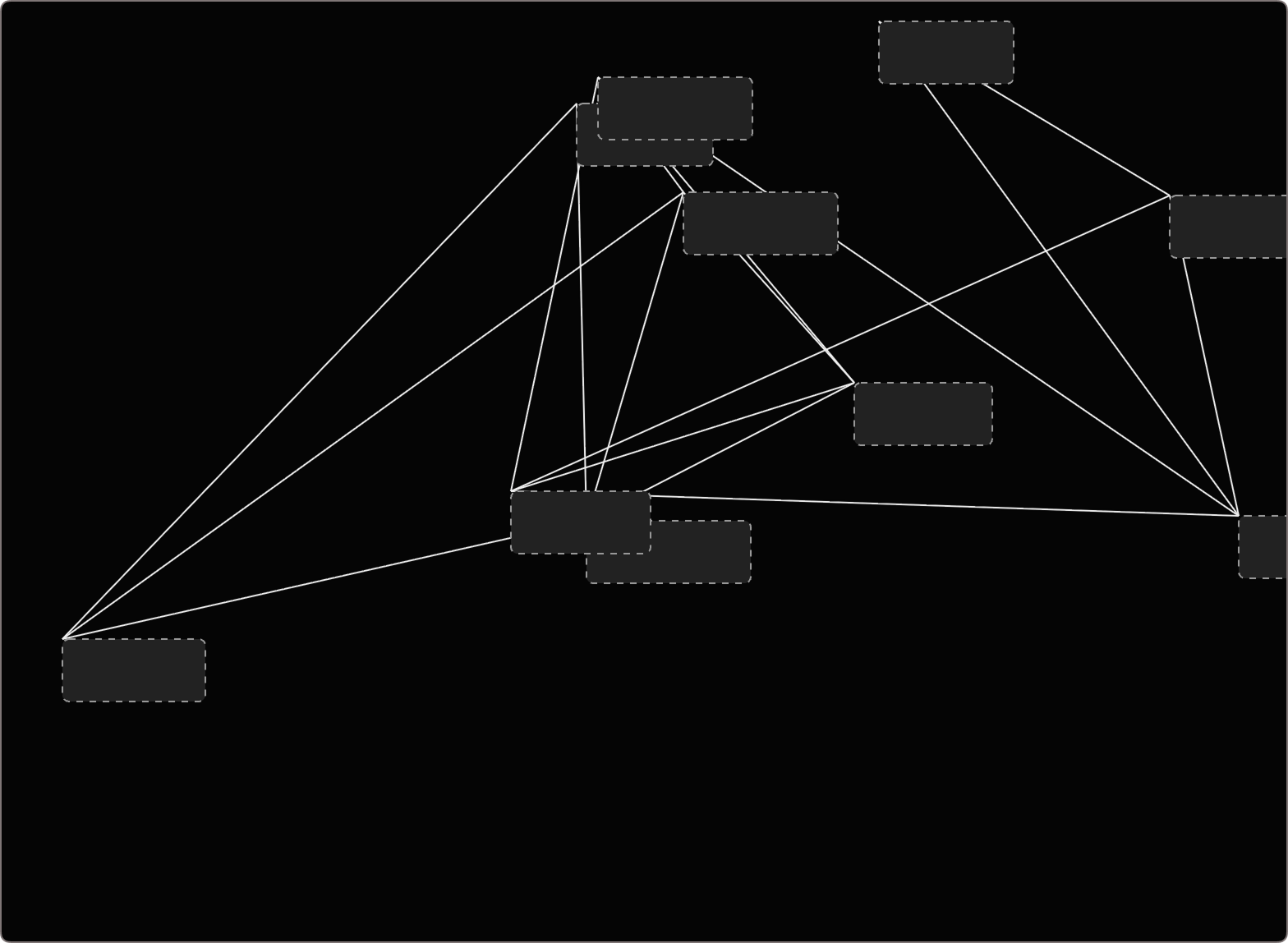
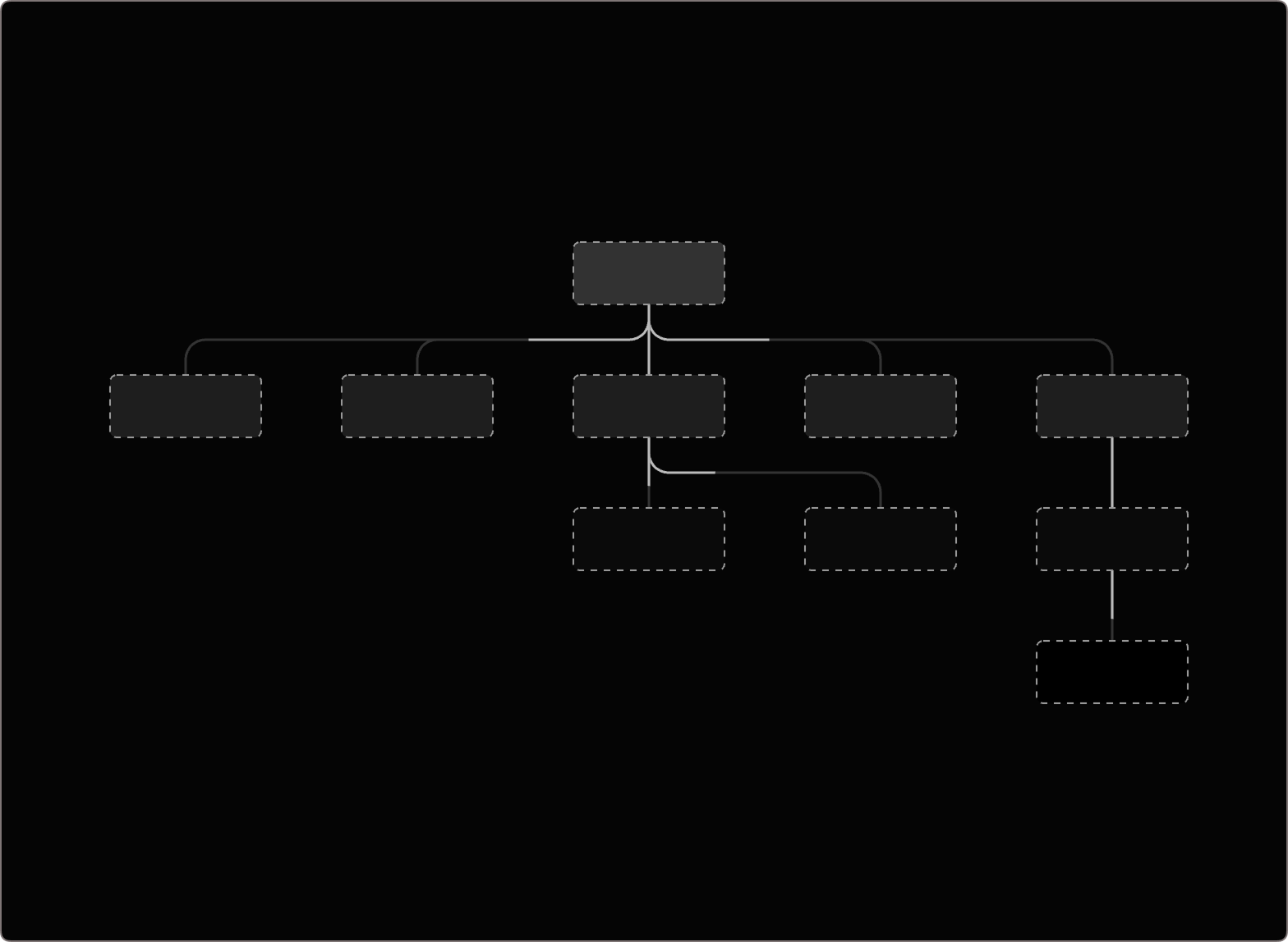
Then we started looking at edge treatment: curves, highlighting, and how the direction of a flow should be communicated. Once you get a larger diagrams, you start to hit harder problems like overlapping nodes, noisy edges, and paths that are difficult to follow.
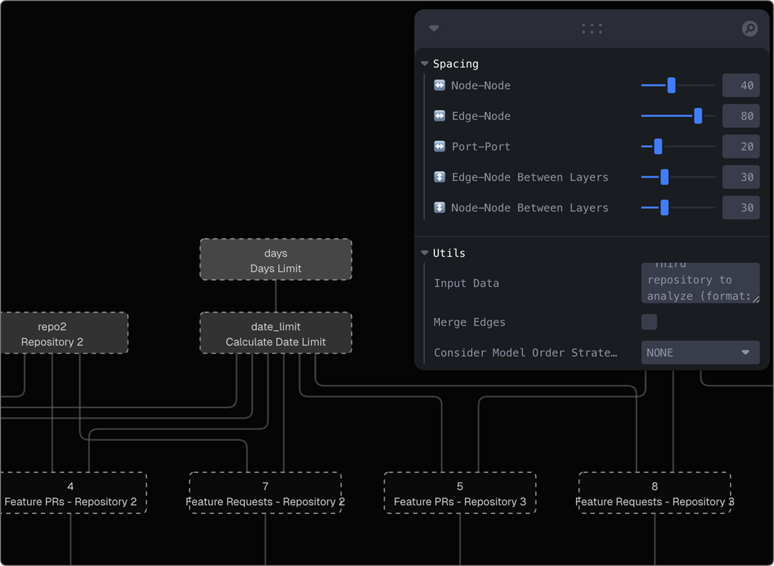
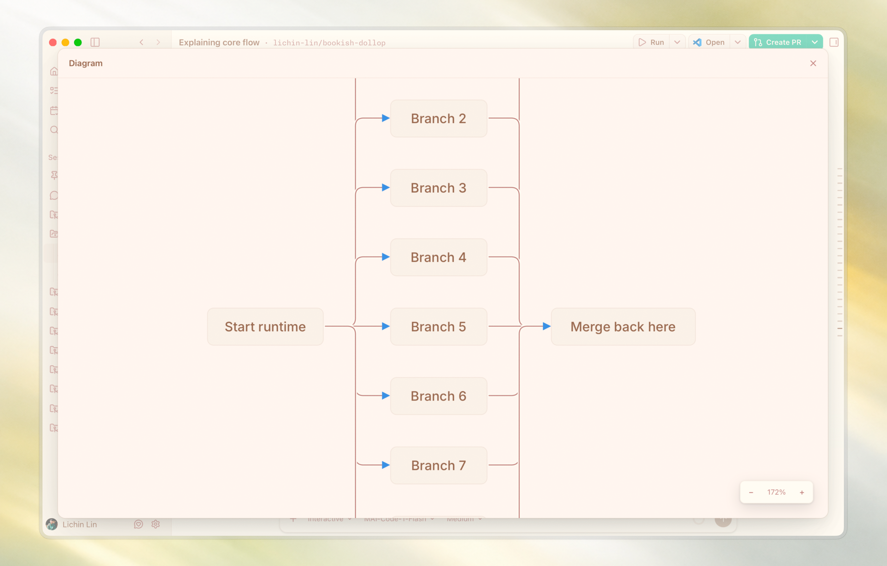
One thing we tried was splitting the edges more clearly, so every connection had its own path and direction. It helped in some ways, because you could see the structure more explicitly. But it also showed us the limitation: once the diagram gets complicated, simply separating every edge can still become noisy:
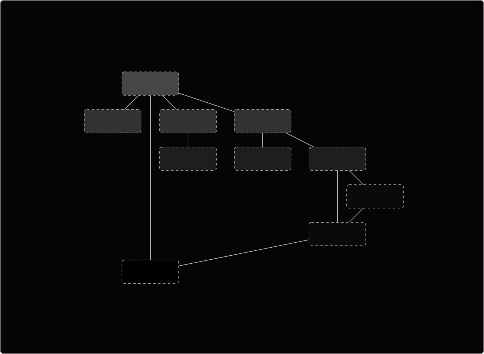
After that, we moved back toward merging the edges. But once you merge edges, you need to be careful about readability. So we added two treatments:
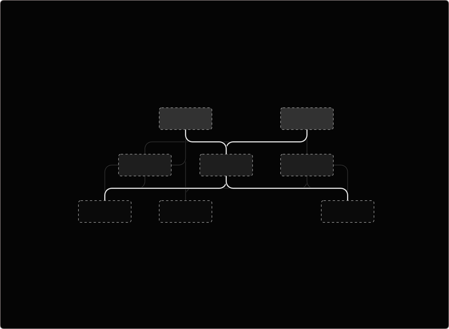
One was edge crossover handling, so when lines intersect, users can still tell which path continues.
Before
After
The other was a special corner treatment inspired by , where the routes feel more intentional and directional.
Before
After
With those explorations, we shipped a version that made Mermaid diagrams clearer and more useful inside the app. For me, this is one example of how we craft UI in the GitHub Copilot app: looking closely at where the experience breaks down, and improving the details until the product feels easier to understand.
At the same time, AI models will keep improving, and some workflows may need less visible UI over time. But until then, there is still a very important layer where people need to inspect, understand, guide, and trust what the system is doing.
That is why design engineering is still so fascinating to me. Even in an agentic workflow, the interface is where people stay oriented, make decisions, and feel in control.